IESE Insight
For the best experience, let data be your guide

Tips to use data analytics to boost user engagement, based on experiments carried out in the Van Gogh Museum.
By Victor Martinez de Albeniz, Ali Aouad & Abhishek Deshmane
How does your customer move across touchpoints? With data-driven experience design, you can answer that question and design interventions that achieve superior results.
The decisions that your users or customers make, as well as the pathways they follow in a physical or digital space, depend largely on how the choices and layouts are presented to them. Only by knowing precisely how a person interacts with your brand can you provide them with an experience that meets or, better yet, exceeds their expectations.
But how do you do that? With data — specifically, the data that users or customers themselves give you the minute they start engaging with your brand. This enables you to make adjustments in a much more effective and targeted way.
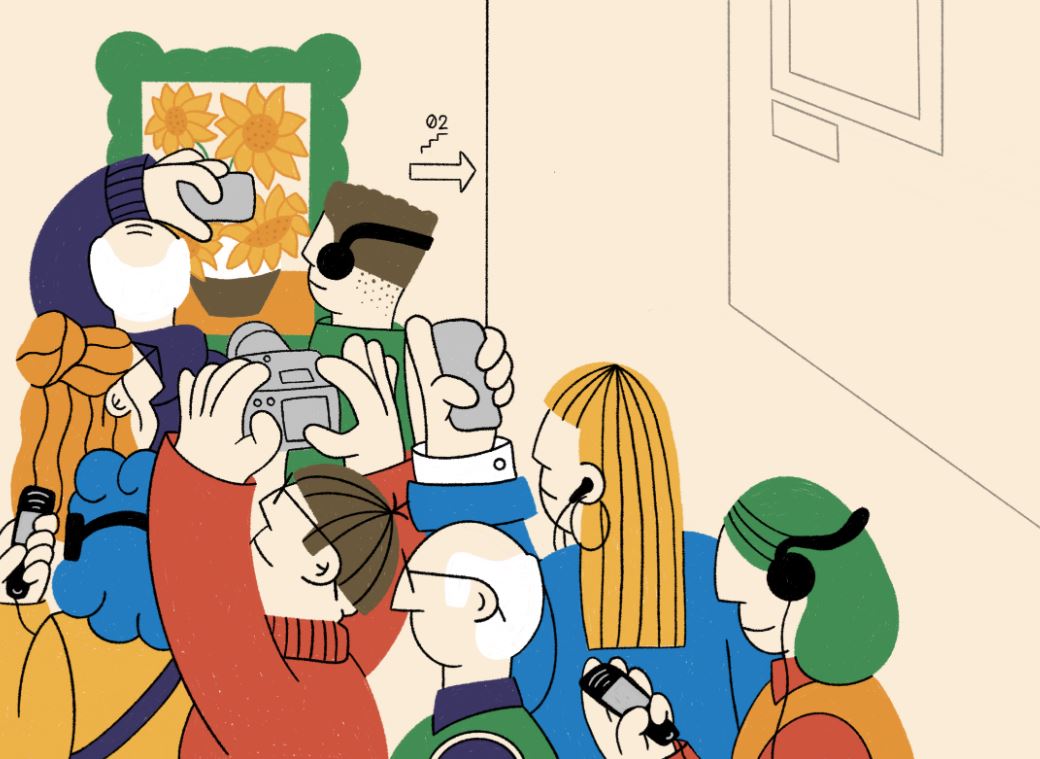
This is what we did in Amsterdam’s Van Gogh Museum, which sought to improve visitor flows around its space in order to avoid overcrowding and congestion and to direct attention to other, lesser viewed items.
Taking advantage of this real-life context with problems common to many experience providers, we developed a model that can be used to optimize layouts and choice architectures, thereby lifting engagement. Through simple design changes informed by data-driven predictors of user behavior, we correctly predicted the paths that visitors would follow with 63% accuracy, and we were able to extend visits to “cold areas” of the museum by around 20%.
Imagine being able to do the same in your own business setting.
Building the best user experience
Whether a museum, a department store, an amusement park or any other type of business context involving a sequential experience, building the best user experience depends on your ability to observe how individuals behave and interact with your brand in the field.
Working in collaboration with the Van Gogh Museum, we gathered data on how visitors moved around the artworks, from the moment they entered the museum until they exited. This helped us paint a full picture of the dynamics of their visit, revealing some common weak points.
Traffic patterns. Visitors were free to move throughout all four floors of the museum as they wished, although most followed the path mapped out for them by the museum. Still, only a minority of visitors made it all the way up to the top floor. However, by applying a few interventions informed by data, we were able to drive 20% more visitors to the top floor.
This underscores the effects of layout and distance on the user experience, particularly when covering large physical areas. Think of how IKEA organizes its stores: the shopper is channeled in one direction and must follow the entire route through the store until the very end. Most large department stores, on the other hand, take the opposite approach, letting shoppers roam freely with very few spatial or behavioral constraints.
What would happen if we flipped those configurations around? What if we let IKEA shoppers stray from the path: they could skip the sections they weren’t interested in, and they could leave wherever and whenever they wanted? Or what if we forced a department store shopper to walk the entire first floor before they could proceed to the next floor? How would such layout changes affect consumer engagement and sales rates?
Often, we don’t know how consumers would respond because stores haven’t tried implementing such changes. But the availability of data today — via radio-frequency identification (RFID), Wi-Fi or mobile device sensors — makes it infinitely possible to track movements throughout different spaces, to try out alternative configurations, to assess the response to those changes with new data, and then to keep refining layout and distance dynamics in desired directions based on continuous data updates. In this way, we are able to make conscious decisions about these dimensions rather than leaving it to legacy routines or guesswork.
Preferences. Museum visitors, similar to shoppers, like a certain amount of variety but not to the extent that it becomes confusing. That’s why museums, like stores, curate their collections according to some organizing logic. So, artworks may be arranged by period, movement, medium or theme. Likewise, clothing stores may group apparel by type, color or season. While there is evidence that putting things into some kind of context helps people make sense of variety, we found that people also operate according to their own preferences and frameworks, which do not always line up neatly with the intended order.
Repetition. Unlike an amusement park, where a visitor may never get tired of going on the same ride over and over again, visitors in museums generally do not see artworks more than once. Museum offerings need to rotate exhibits to keep people coming back. Also, waiting in long lines is something visitors seem to be able to abide in order to ride their favorite rollercoaster, but is generally not favored by visitors wanting to admire their favorite painting. Data analytics can help managers know when to change the offer before it gets stale, and also how to manage wait times, either to reduce them or to enhance the offer of adjacent areas to be an attractive option while people wait.
Fatigue. Visitors tend to get tired after 30 minutes. Knowing this means you can provide a rest area or some other intervention at key points in the journey before people get tired out and leave. This applies equally in store environments as it did in the museum.
Gather data relevant for improving the experience you are offering
Who in your organization is responsible for looking at data and analyzing it like we did for the museum? The good thing is, your organization doesn’t have to go out searching for data because you are already most likely sitting on tons of it — every time a customer visits your store, makes a transaction or interacts with your website. The challenge is not lack of data; rather, it is about deciding which data-gathering tool will give you the relevant information you need for improving the experience you are offering.
In our case, we used the museum’s multimedia guide. This device tracked visitors’ movements and revealed their preferences based on which items they clicked on, and when. We could tell how long a person remained in front of a painting, which artworks they passed by, and when they terminated the visit. And based on such metrics, we were able to make inferences of visitor likes, dislikes and so on.
The multimedia guide is the museum equivalent of RFID technology that arose decades ago and was first employed in warehouses to track shipments. Over the years, supermarkets have put sensors in shopping carts to find out which aisles customers go down and at which points they stop as they consider purchases. More recently, stores have been using Wi-Fi or Bluetooth beacons to triangulate customer movements and even connect directly with customers, sending well-timed messages to their smartphones or pinging them a discount as they shop.
Apps are another great way to collect data and actively manage it in environments where there are waits, stops or bottlenecks. The Disney theme park app, for example, geolocates visitors so that lines can be managed better and visitors can be redirected to attractions at certain times. Data analytics can anticipate changes in traffic patterns when it rains and can predict which areas of the park will get busiest at different times of the day. Knowing this, app users can schedule their access to an attraction, reserve tickets to a show or sometimes even jump the queue. This is an example of how a data tool becomes as useful for the consumer of the experience as it is for the experience provider.
Simulate the future by building data models and tracking changes
Once you have gathered your data insights with your chosen tool, you must explore which interventions would be most effective for your needs. This is when a data model, like the one we built for the Van Gogh Museum, comes into play. Building such a model enables you to simulate trajectories as you propose small changes in the architecture of the space — either literally, in terms of the physical layout; or virtually, in the way you “architect” choices through nudges.
First, determine which variables most affect your user’s journey. In our case, we estimated the probabilities of the visitor transitioning from one area to another, taking into account the influence of factors such as the distance between each artwork and the effort involved in changing floors. We also looked at the effect of artistic criteria, like genre, and the highlights proposed by the multimedia guide.
Naturally, your business may not be interested in these same variables. An outdoor theme park may pay more attention to the effects of weather, whereas a jewelry store might measure the implications of keeping jewelry locked behind glass cases versus displaying it out in the open so customers can try it on for themselves.
When it comes to choosing variables, size also matters. Small stores don’t have as much room to play with as big-box retailers. Small shops may prioritize efficient design, placing products conveniently near the door where customers can get in and out quickly.
Going back to our Van Gogh Museum experiment, we constructed a dataset of visitor choices based on the trajectories of 25,000 randomly selected visitors during a two-month period (before the 2020 pandemic). The key variables for us were layout distance, artistic characteristics, time pressure and congestion, and we studied the consequent effects of managing these variables. Our findings contain some useful takeaways.
Play with attractiveness levels. Just as museums exploit their star exhibits, businesses must make the most of their star items that generate the most public interest. Which of your items act as bait? Which ones are better for impulse shoppers and which ones are your evergreens? Where do people engage more and less? This can be determined by analyzing the purchases made per zone of the store. You can also compare interest levels in the same product in the physical vs. online store, measured not just by sales volume but by conversion rate, so you can see what percentage of online interest is converted into actual sales. You may find that something that appears to sell well in the physical store actually sells little in relation to the interest it generates online. In which case, you might want to adjust how that product is displayed in the store, to give it maximum exposure and convert more of that interest into sales.
Observe congestion patterns. Where are pileups occurring, and how do users respond when things get too busy or crowded? In the museum, visitors opted to escape the congestion and came back when there were fewer people, which meant deviating from the linear route. They ended up spending more time viewing other paintings that didn’t receive as much traffic. This resulted in an increase in the total number of works viewed. Such dynamics present a golden opportunity for many types of businesses. A theme park, for instance, may stage live music or locate gift shops adjacent to the rides and attractions that are most in demand.
Shorten distances. Bear in mind that the farther away the object of interest, the less accessible it seems to be. The perception of a large distance reduces the chance of people moving toward it, because it seems to require effort. Which elements of your offer create perceptions of distance and added effort? The location of changing rooms? The use of stairs?
Distance incentivizes skipping-out or wandering-off behavior, which may leave the user with a feeling of loss, like they have missed out on something; they leave with an incomplete experience. This doesn’t just apply to physical spaces: the online user who anticipates clicking through many different webpages before getting to checkout will probably click away from your site, feeling frustrated by their experience.
Use the time you have. We tend to plan our purchases, visits or outings by estimating how much time they will take. When that time runs out, we feel under pressure — what we observed as “museum fatigue.” When the user starts feeling tired, they change their plans. In our study, when time was short, visitors went for whatever was most attractive within proximity. Knowing this, businesses can build this into their positioning of items, allowing easy access to attractive alternatives.
How much time is right? Museums would like the visitor to stay for as long as possible, knowing that the more artworks they see, the more fulfilling the cultural experience. This fits with their mission. Malls have a similar interest in retaining shoppers, although for very different reasons, known as the Gruen effect. Named after Victor Gruen, who designed the first shopping malls, the idea of the mall layout is to make shoppers lose track of time and forget why they went there in the first place; they become distracted and disoriented, making them more susceptible to impulse purchases. That may be a quick win for the retailer, but is it good for the customer? In designing your own user experience, you should be aiming for a win-win.
Stop doing things by gut and be guided by analytics instead
The only way to know which design is right for you is to run your own simulations. Doing so does not even require that you relocate any products. For our museum simulations, not a single painting was moved. We simply manipulated the datasets generated from the multimedia guides until we found the combination of variables that achieved the optimal results.
The actual intervention was to alter the order of appearance of just one preference listed on the multimedia guide menu. The painting never moved but the multimedia guide highlighted it as a top hit. By listing it as essential viewing, visitor engagement went up from 30% to 80%. The reverse (lowering its position on the menu) resulted in visitor engagement going down.
Next, we wanted to see if we could reduce the effects of fatigue that arose by the time people reached the end of the first floor. For that, we eliminated visiting three paintings located at the floor’s end from the multimedia guide. Instead, we highlighted three other paintings positioned at the start of the tour. With this change, visitors did not seem to tire; in fact, they lengthened their stay and proceeded to the upper floors.
Coincidentally, during November and December 2019, the Van Gogh Museum underwent a series of construction works and building maintenance operations, which required several well-known artworks to be temporarily relocated. It was the ideal natural testing ground because it replicated the exact conditions and factors that we were attempting to simulate using data. We took advantage of these relocations to see how position, distance, adjacent works and so on actually affected visitor transition rates, and then we compared the real-world findings with the predictions of our model. Even for the brief four days that the works changed location, the odds of visitors transitioning to neighboring artworks skyrocketed. And when the paintings returned to their former locations, transition rates dropped dramatically. This suggests that the impact of layout change is even larger in magnitude than that captured by our model.
You can do likewise with your own data. It is time to stop designing layouts by gut feeling and start doing it guided by quantitative analytics, which can clearly and accurately render the impact of design decisions.
Moreover, companies would do well to incorporate (if they haven’t already) a professional profile within their organization whose role is dedicated to the systematic analysis of data to optimize the design of their user experience.
Now go and create your own masterpiece
- Define your goals
- Use data to observe actual patterns
- Analyze which factors most affect your user experience
- Adjust variables and measure results
MORE INFO: “Designing layouts for sequential experiences: application to cultural institutions,” by Ali Aouad, Abhishek Deshmane and Victor Martinez de Albeniz is published in Management Science (2025) and was featured by INFORMS.
A version of this article is published in IESE Business School Insight 163 (Jan.-April 2023).
This content is exclusively for personal use. If you wish to use any of this material for academic or teaching purposes, please go to IESE Publishing where you can purchase a special PDF version of “For the best experience, let data be your guide” (ART-3451-E), as well as the full magazine in which it appears, in English or in Spanish.

Enter your email below to unlock
EXCLUSIVE FREE CONTENT FOR INDIVIDUAL USE
* Required fields
Note: Entering your birthdate enables us to send you info relevant to your life stage and career.