
IESE Insight
6 charts to understand the global economy now
What are we economists looking at now? Here are six charts that help us understand economic growth trends, trade tensions, Brexit uncertainty, tools beyond quantitative easing, and the future of work.
By Núria Mas
A picture is worth a thousand words, or so they say. These six charts illustrate key factors that have shaped the economy in 2019 and provide a look at what's next.
Decelerating global economic growth
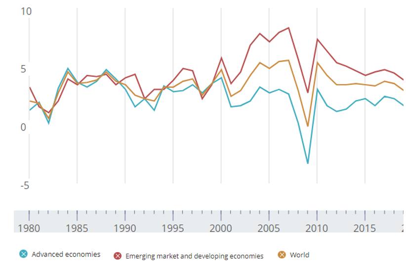
Soon after the financial crisis hit, the recovery began, reaching a 5.5% global growth rate in real GDP by 2010. After 2010, growth slowed down, with the exception of a slight uptick in 2017, when the global economy grew by 3.8%. But since 2017, global GDP has decelerated decisively, with 2019 looking to post the worst performance seen in a decade, as seen in the first graph below. Yet, the economy is expected to rebound by 2020, driven mostly by emerging economies' performances. Their collective real GDP growth is expected to increase from 3.9% this year to a 4.6% in 2020, according to the International Monetary Fund (IMF).
Chart 1. Real GDP growth
Source: International Monetary Fund
Escalating trade tensions
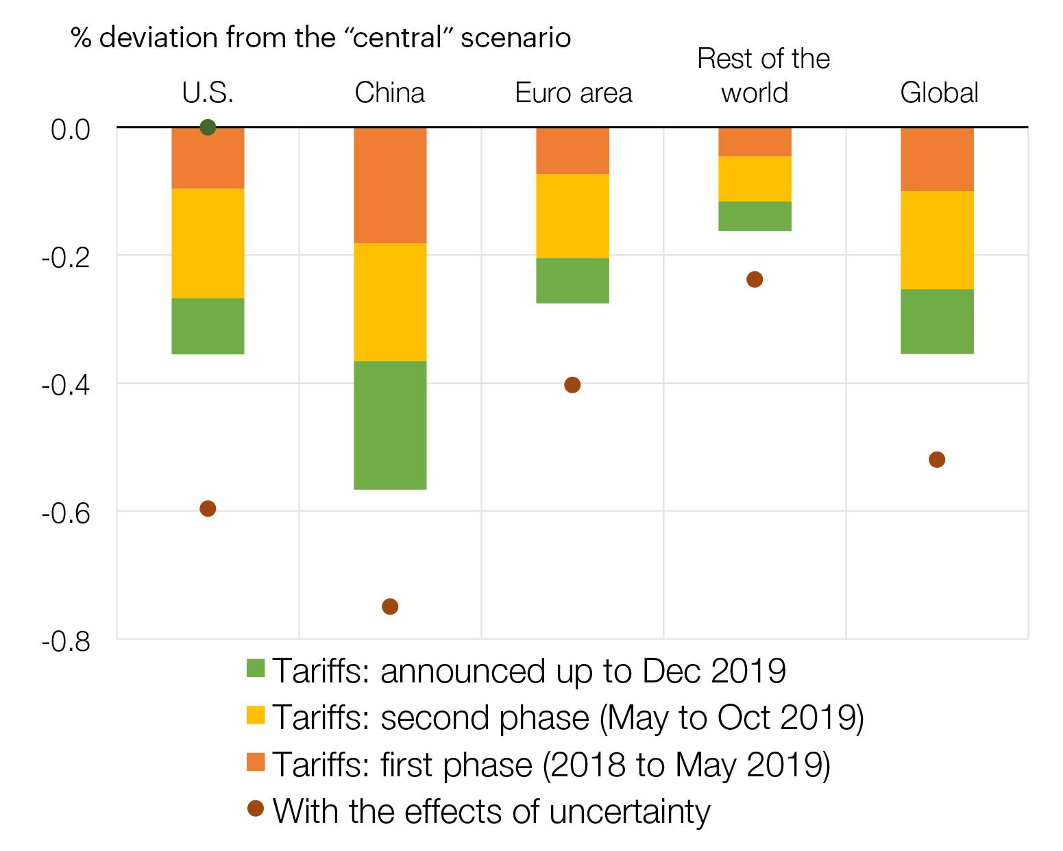
Escalating tensions between the U.S. and China are already increasing trade tariffs and taking a toll on global GDP growth -- reducing it by 0.8%, according to recent IMF estimates. The second graph shows the Bank of Spain's estimates for the cumulative effects of recent trade tensions (as of December 2019) on global and regional GDP growth looking ahead to the end of 2021. The impact continues.
Chart 2. Trade tensions: effect on GDP projected for Q4 2021
Source: Bank of Spain
Clearing up Brexit uncertainty
2019 has been the year of the no-go for Brexit, with a new chapter now being written by the December 12 election results. With Prime Minister Boris Johnson winning a resounding parliamentary majority, he is likely to go ahead and execute Brexit before the January 31 deadline, following the withdrawal agreement he has already negotiated with the EU. A study by the UK in a Changing Europe, an independent research group, predicts Johnson's deal would decrease the U.K.'s GDP per capita by 6.4%. This is more than the reduction implied by May's deal (4.9%) but less than the effect of a no-deal Brexit (8.1%). In any case, this would just be yet another step in a very long process whereby the European Union and the U.K. will need to agree not only on the Brexit withdrawal, but also on their final trading relationship. I am, however, quite optimistic given the importance of Europe for the U.K., as reflected in the next graph.
Chart 3. The U.K.'s trading partners, by country and continent
Top export destinations
Top import origins
Source: UN Comtrade data via the Observatory for Economic Complexity (OEC), MIT
Quantitative easing may not be enough
Throughout the crisis and recovery periods, central banks everywhere have deployed different measures to support their economies. Following signs of economic recovery, the Federal Reserve started raising interest rates in the U.S., but this was recently reversed in the face of global weakness. The euro has witnessed disinflationary pressures since 2013. This fact, together with decelerating global growth, has led the ECB to resume its monetary policy of easing. In this context, I think it's becoming quite obvious that monetary policy cannot be the only game in the eurozone and that other policies should play a role, too -- such as the capital markets union and/or fiscal policies. The charts below track monetary policy stimulus in the euro system, U.S., Japan and U.K.
Chart 4. Monetary policy stimulus: policy interest rates and central banks' balance sheets
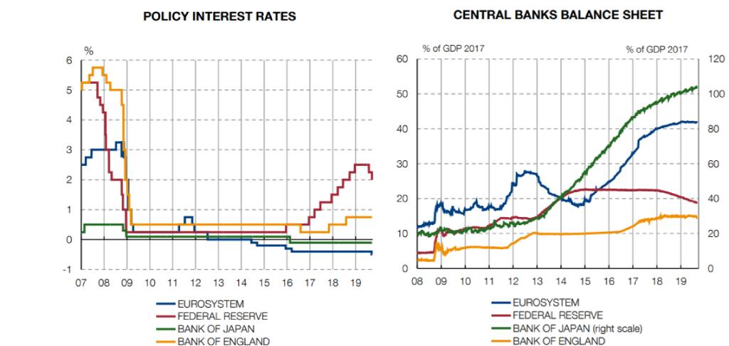
Note: the right scale on the second chart below (up to 120%) only measures the BoJ assets, which have grown to more than 100% of its GDP.
Source: Bank of Spain, with additional data from Datastream and the European Central Bank
Preparing for the future of work
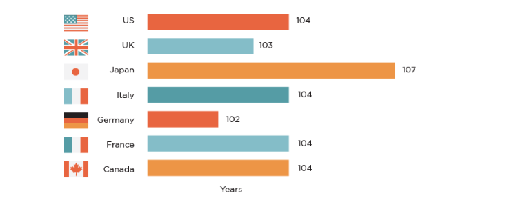
The nature of work will change drastically in the coming decades. First, life expectancy in advanced economies is increasing significantly. The fifth graph shows that children born in 2007 have a long stretch of time ahead to live. They will need a labor market that is flexible enough to allow as much retraining as possible at various points in time in order to adapt their skills to what the future might need.
Chart 5. Oldest age at which 50% of babies born in 2007 are predicted to still be alive
Source: Human Mortality Database, UC Berkeley, and the Max Planck Institute for Demographic Research via www.the100yearlife.com
Second, technological advancements will have a profound impact on the labor markets of many nations. The sixth and final graph depicts the proportion of workers in 18 countries (and the OECD average) who are currently working in occupations where there's a high risk of automation. History shows us that technological progress improves lives, but also that transitions are always complicated, with many left behind. I believe it's crucial that we develop policies which help manage this transition while still being able to maximize the potential benefits, for the good of society. We need to start thinking which steps we need to put in place now to make work work for everyone.
Chart 6: Share of workers in select OECD countries with high risk of automation
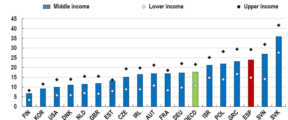
Note: "Lower income" defined as households with income below 75% the national median. "Middle income" are households with income between 75% and 2x the national median. "Upper income" are households with income above 2x the national median. The risk of automation is calculated as the average of the risks of automation by occupation, weighted by the share of each occupation in the income class.
Source: OECD secretariat calculations based on LIS and PIAAC
